The new Art-Spire is here !

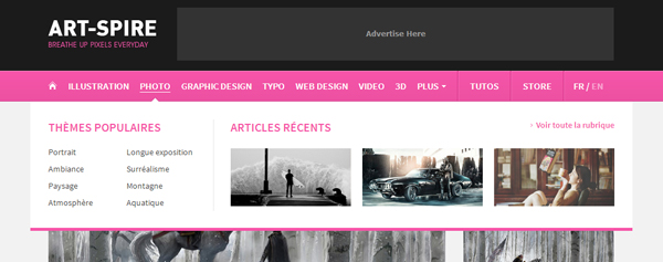
We promised you a surprise for this new year and here it is : a brand new version of Art-Spire. For this version 4, the structure of the website remains close to the previous one so you can keep your marks. However the design has been modernized and clarified. As you may have noticed, one of the novelty is the addition of a brand new tutorials category which will be enriched over time. Right now there is just a tutorial in French but don’t worry, there will be English ones too. Also, the menu is more visible and you will have a preview of popular themes and recent articles when you roll over a category. Besides, don’t miss the link “plus” on the menu which shows a list of other categories. In fact we have refined the way our articles are sorted in order to be more accurate.
At the bottom of each page you can find two blocks listing articles. The first one gives a quick access to popular articles, interviews, Weekly Episodes and also Showcases. In this new version we will focus more on showcases because we have noticed they are quite popular amongst our readers. That’s why we are going to publish big showcases on a regular basis this year. And this will start next week! Concerning the second block, it displays random articles from Art-Spire as in the previous version so you might be familiar with it already.
However the real changes are in the field of responsive design and mobile. As you may know, it is now possible to visit a website from many devices: mobiles, tablets, notebooks, desktop computers or even TV. So for this new version we wanted to create a website that takes advantage of the different screen resolutions. The standard version (computer and tablet) displays more or less content according to the resolution. Same applies to the social sharing zone displayed in the article: it is lateral when viewed on a large resolution but comes just below the article when the resolution is small. As for mobile phones, we have created a brand new specific site from scratch!
This mobile version is optimzed for iPhone and Android. Loading times are reduced and the navigation is finger-friendly. Of course the design adapts itself to the screen resolution and orientation.
We hope you’ll love this new version! Don’t hesitate to give us your opinion about it by using our new comment system. Now you can log with Facebook, Twitter, Gmail or Disqus to comment more easily.


